

(2 min read)
Nearly half of all emails are opened on mobile devices, so it’s important to make sure your Targeted Emails look as good for those users as they do for those reading your messages on desktop devices. The Drag & Drop editor makes it easy to build these mobile-ready messages and fine-tune your message for each audience.
Editing your mobile and desktop versions
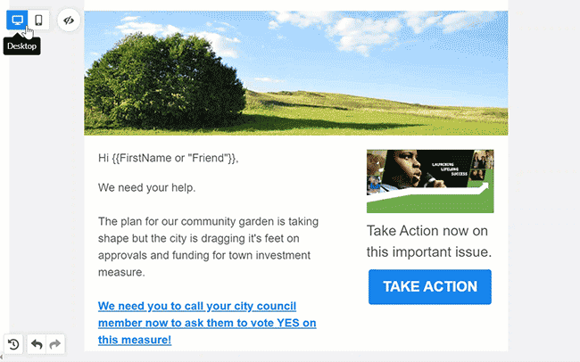
You can switch between the desktop and mobile editing view using the link in the upper left corner of your editing screen. Selecting the mobile version editor will change the dimensions of your email and give you additional options that will help you customize your layout.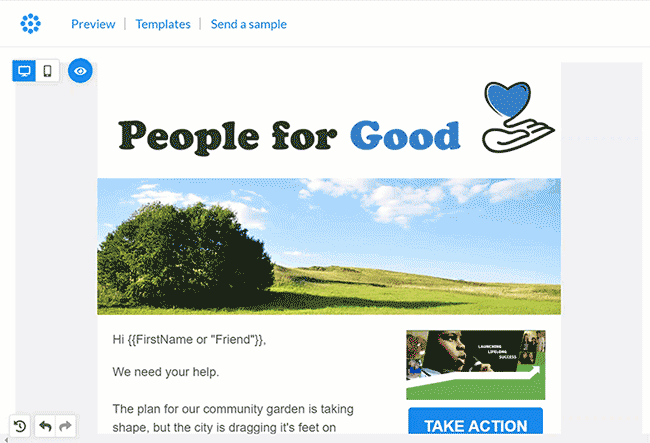
Hiding or showing elements
Hide or show different rows or objects in your mobile and desktop layouts by using the Hide on toggle available from the right-side settings panel when you are editing a particular row or content object.
Use the desktop or mobile icons to choose which devices you want to hide the item from. If you choose to hide a row, all the content items in that row will also be hidden.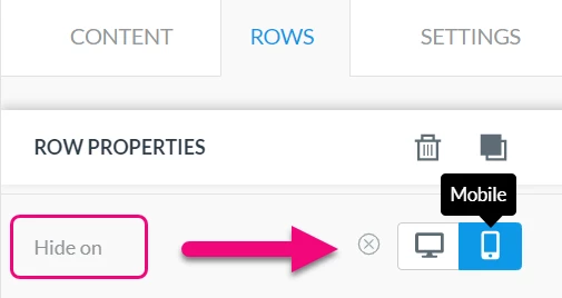
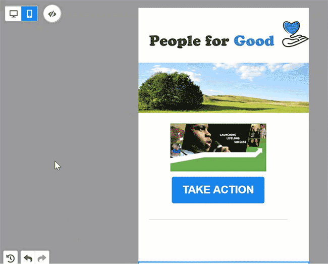
If any of the items in your email are set to be hidden, you will see an eye icon appear in the upper left of the editor. You can toggle this to view the hidden items in your layout (which appear greyed out) or hide the elements so you see the email as the receiver would experience it.
If you later decide that you want to remove the hidden settings and display your element on both types of devices, use the circle-X icon to deselect them both.
Using Reverse stack
The typical behavior for mobile viewing is to stack content items that appear in a row. This helps conserve horizontal space on mobile devices that can have very small viewing widths.
In the Drag & Drop editor, the default behavior is for content objects in a row to be stacked from left to right when viewed on mobile. This means, for example, that if you have an image on the left side and text on the right in the desktop view, then you will see the image on top and the text below on a mobile device.
Sometimes, you may not want this default behavior, especially if you have multiple rows that alternate placement of the images and text (as you might in a newsletter). You can easily flip the layout on the rows you want to change by using Reverse stack order on mobile.
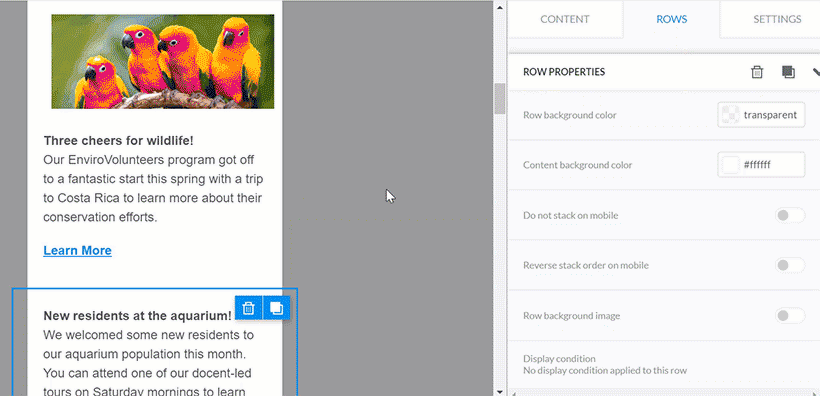
Using Do not stack on mobile
In rows where you want to keep your items side-by-side in the mobile view, you can select Do not stack on mobile. This will force the elements to remain next to each other.