


How do I use Que Data Studio?
Overview
Impact Hub includes a set of AI-assisted features that help you explore and communicate your data using plain language — no report-building experience required. These features are available through Que Data Studio, which appears within Impact Hub and is also embedded directly in the Builder workspace.
This article explains what each feature does, who can access it, and what to expect when using it.
Important things to know
- AI features in Impact Hub work with your organization's own data — the datasets and dashboards you already have access to.
- AI features are available to Author Pro and Reader Pro users only.
- AI-generated answers and summaries are based on the data in your connection. Always review outputs for accuracy before sharing.
- If a feature appears in the interface but doesn't return results, confirm that the relevant dashboards and datasets have been shared with your account.
What is Que Data Studio?
Que Data Studio is the AI-powered layer built into Impact Hub. It lets you interact with your data using natural language. Instead of navigating filters or requesting a custom report, you can type a question — like "How many participants enrolled last quarter by program?" — and receive an answer with supporting visuals in seconds.
These features work directly with your Impact Hub dashboards and datasets.
Que Data Studio features
Available to Author Pro and Reader Pro users
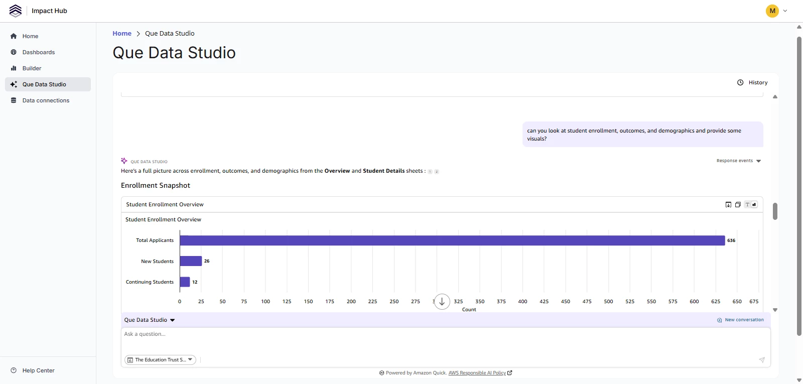
Ask a question about your data
What it does: Type a question about your data and receive a multi-visual answer — charts, tables, KPI cards, and a plain-language summary — all generated automatically.
How to use it: Open Que Data Studio and type your question in the chat bar. You can ask follow-up questions to refine the answer or explore a different angle.
Example questions to try:
- "Show me enrollment by program for the last 6 months"
- "Which service type had the most participants in March?"
- "Compare total services delivered this year vs. last year"
- "How many active enrollments did we have per day last month?"
What to know: Que Data Studio works against pre-configured dashboards and datasets you have access to. If it doesn't return results, confirm that the relevant dashboards and datasets have been shared with your account.
Create an executive summary
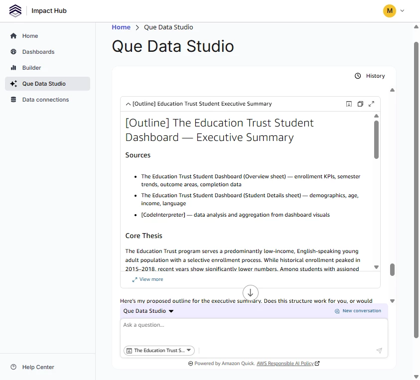
What it does: Generates an instant AI-written summary of a dashboard, surfacing key trends, changes, and notable data points — without you having to read through every visual individually.
How to use it: Open a published dashboard in Que Data Studio and select Executive Summary from the chat suggestions, or request it by typing in the chat.
What to know: The executive summary reflects the data as it appears in the dashboard at the time of generation. If filters are applied, the summary will reflect the filtered view. Refresh the dashboard data before generating a summary if you need the most current results.
Tell a story with your data
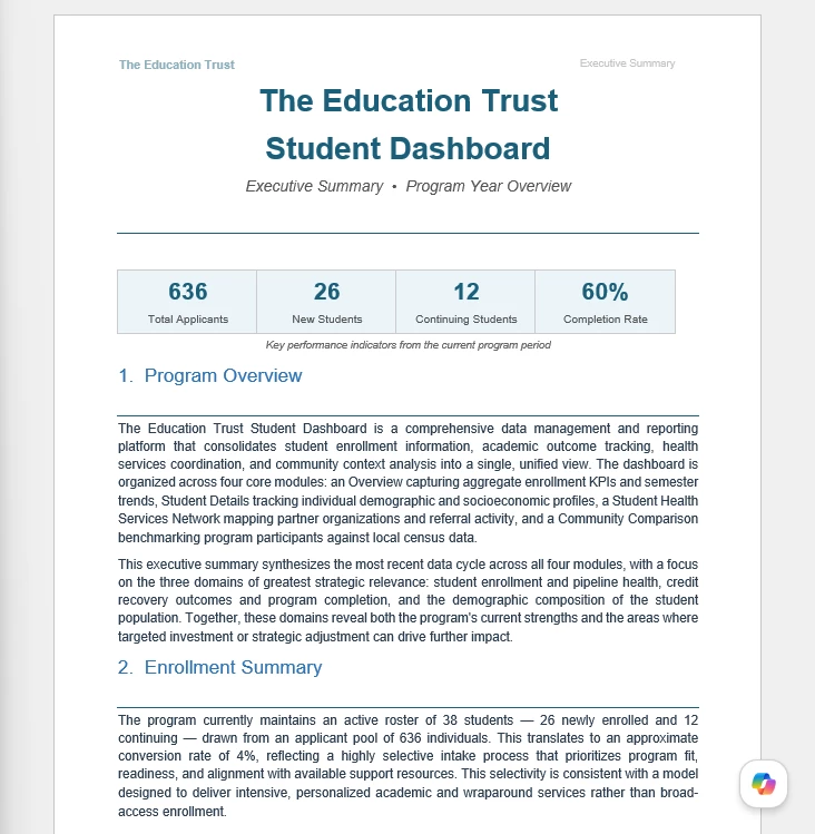
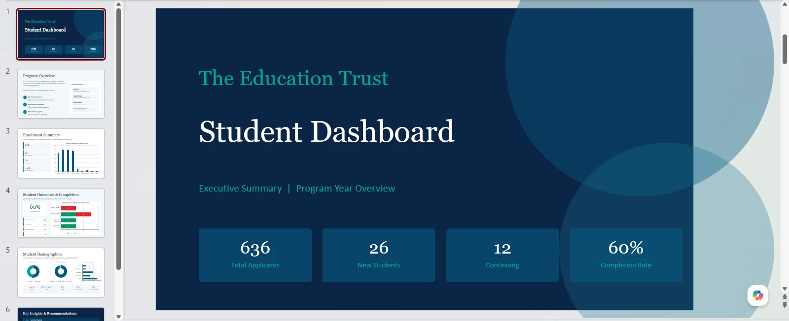
What it does: Creates a formatted document or slide-style presentation that explains your data using a combination of AI-generated narrative, visuals from your dashboards, and your own commentary. You can export the finished document as Word, Excel, PDF, or PowerPoint.
How to use it:
- In Que Data Studio, describe what you want the story to cover. For example: "Summarize Q1 enrollment trends by program and highlight any significant changes. Include key visuals that highlight primary topics like enrollment."
- Review the generated draft. Visuals, text, and layout are all editable.
- Add your own context, remove sections that don't apply, and adjust the narrative as needed.
- Export and share the story.
What to know: The generated document is a starting point, not a final product. Review and refine it before sharing.
Report Builder Assistant
Generative BI authoring — Author Pro only
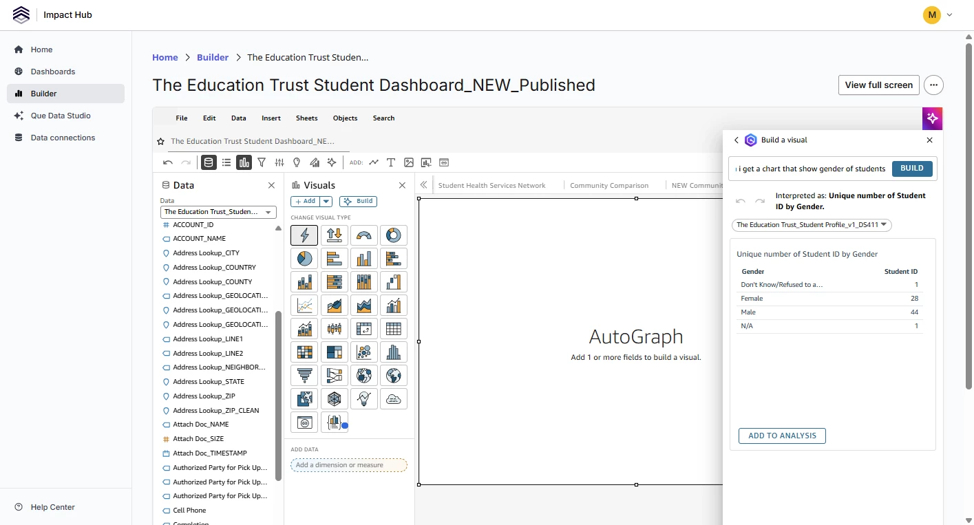
What it does: Lets you use plain language to build and refine report visuals directly in Builder, instead of manually configuring chart types, fields, filters, and formatting options.
How to use it: While working in an analysis in Builder, select a visual and choose the Build for me or natural language option. Describe what you want. For example:
- "Change this to a line chart and show data by month"
- "Add a filter for the last 90 days"
- "Calculate the percentage change compared to the same period last year"
You can also use natural language to generate calculated field expressions. Describe the calculation you need, and Impact Hub will write the expression syntax for you.
What to know: This feature is available in the Builder workspace and is also accessible through Que Data Studio. The AI generates visuals and calculations based on your description and the fields available in the dataset. Review all outputs before publishing.
What AI features cannot do
These features do not:
- Access the internet or external websites
- Read uploaded files, documents, or spreadsheets
- Pull data from systems outside your Impact Hub connection
- Make changes to your Apricot data
- Generate answers from data you don't already have access to in Impact Hub
All AI outputs are based on data within your organization's connected Impact Hub datasets, subject to the same permissions and access controls as the rest of the platform.
Troubleshooting
Pre-checks
Does your role include the feature you're trying to use? AI features are available to Author Pro and Reader Pro users only. Generative BI authoring in Builder requires an Author Pro role. If you don't see a feature, confirm your role with your Impact Hub administrator.
Do you have access to the relevant dashboards and datasets? Que Data Studio works against the dashboards and datasets you have access to. If you can't view a dataset in a report, you won't be able to query it through Que Data Studio either.
Is the dashboard published? Executive summaries are only available on published dashboards, not on analyses in Builder.
If something looks off
Que Data Studio returned an unexpected answer. Check which dashboard or dataset is active. Try rephrasing your question using specific field names or values from your dataset.
The executive summary is reflecting outdated data. Executive summaries are generated from the data currently loaded in the dashboard. If the data hasn't refreshed recently, the summary may not reflect the latest records. Refresh the dashboard first, then regenerate the summary.
A generated story includes inaccurate figures or descriptions. AI-generated narratives are based on the data in your dashboards at the time of generation. Review all text and calculations before sharing. Cross-check any figures in the narrative against the underlying visuals.
Natural language authoring in Builder produced an unexpected visual. Try rephrasing your description with more specifics — include the field names, aggregation type (count, sum, average), and time period you need. You can also manually adjust the generated visual after it's created.