


Hello, all!
I’m currently trying to build a report that includes a graph that shows various assessment scores over time. Within the graph’s editing window, there is no option to have a date/time data field as a column.
I found a slight workaround by placing the date field as the first column in the report, and it generates my desired graph:
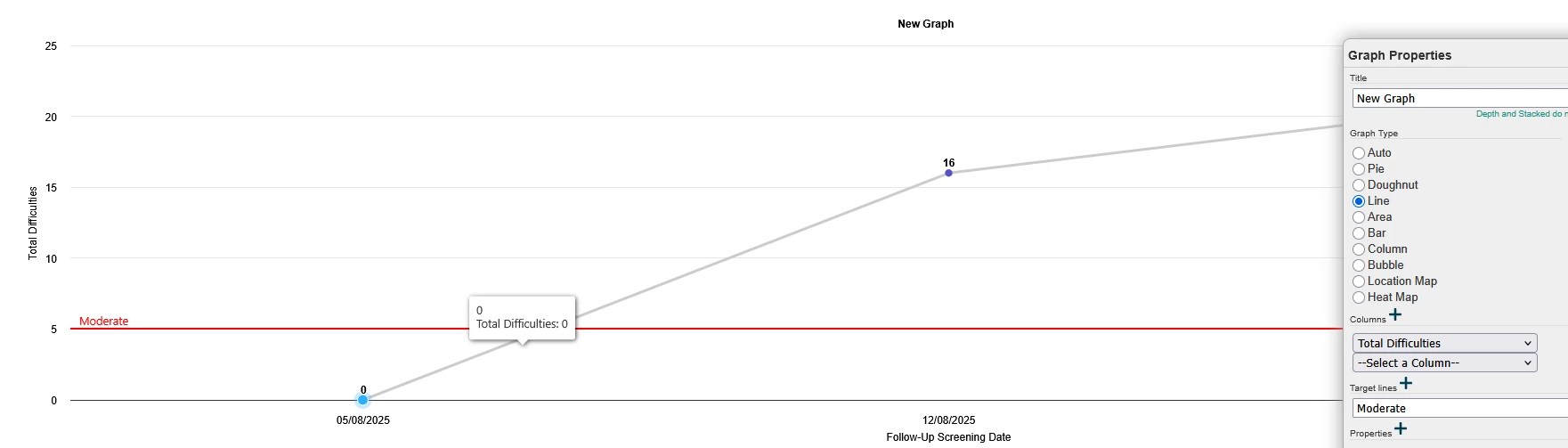
However, if I add a second score field, it automatically un-converts the x-axis from the date field.
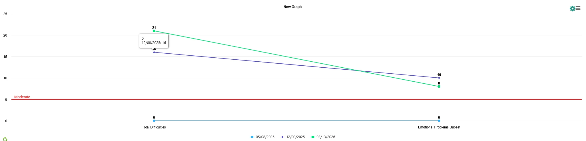
I’m not sure if I’m missing something, or if this type of graph isn’t available in Apricot’s native reporting? Any guidance would be much appreciated! Thank you! :)